The Most Underused Real Estate in Email Marketing
Marketers spend hours perfecting subject lines, crafting persuasive calls to action, and fine-tuning visual hierarchy. Every detail of an email is scrutinized, until we get to the footer. That last scrollable section often gets tossed in as an afterthought, packed with legal disclaimers and perfunctory links.
But email footer optimization is more than just a compliance necessity. When designed with intention, it becomes a strategic asset. It can reinforce your brand, improve the customer experience, encourage engagement, and even boost conversions. And unlike the hero image, which competes for attention, the footer appears just as the recipient decides what to do next.
Done right, it becomes your digital closing argument.
Why the Footer Deserves a Closer Look
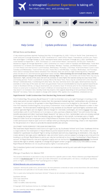
At a minimum, your footer needs to meet regulatory requirements like a physical address and an unsubscribe link. That’s non-negotiable under laws like CAN-SPAM, GDPR, and CASL. But compliance is just the baseline. Smart brands use this space to drive trust and interaction.
Consistency is key. Your footer should match the tone and design of the rest of your message. If your email uses a sleek color palette and clean typography, the footer should follow suit. Otherwise, it feels like a cut-and-paste job, and your brand equity takes a hit.
Footer content also needs to be functional. Add icons that link to your social media profiles. Make sure support information is visible and usable. And if you’ve got a loyalty program, seasonal promotion, or high-performing blog post to share, this is your last chance to highlight it. A soft CTA here can extend the value of your message without overwhelming it.
Design Like It Matters. Because It Does
Footers need to work across every screen size, especially mobile. That means no squint-worthy fonts or crowded layouts. Every element should be touch-friendly and visually distinct, with enough contrast to remain readable in any lighting condition. Accessibility isn’t just a nice-to-have, it’s table stakes.
Using iconography can boost scannability, helping readers find what they’re looking for faster. A well-placed shopping bag, envelope, or app store badge can convey meaning more efficiently than text alone. And while you’re at it, consider adding a “recovery” module, a thin banner just above the footer that repeats a key offer or rephrases your primary CTA. It’s a smart way to re-engage those who scroll without clicking.
Checklist for Designing a New Email Footer
Use this checklist to ensure your creative team covers all the essentials:
- Physical address and unsubscribe link for compliance
- Logo, brand colors, and approved fonts
- Social media icons with active links
- Customer service email or contact number
- Optional CTA (e.g., link to website, blog, or offer)
- Mobile-responsive layout
- Visual iconography to support scannability
- Recovery module with repeated promotion or offer
- Links to Privacy Policy or Terms of Use, if applicable
- Tested across clients and devices
Inspiration Worth Stealing
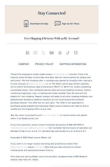
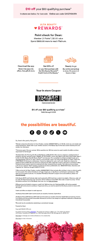
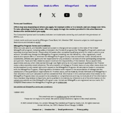
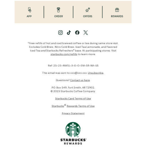
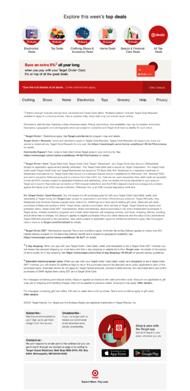
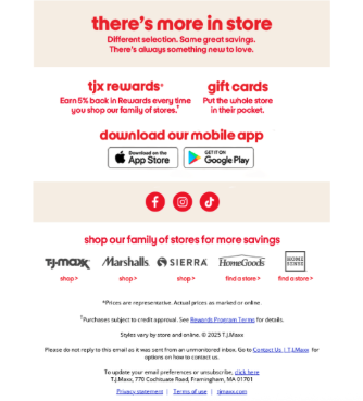
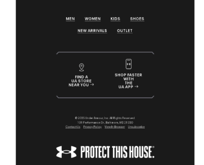
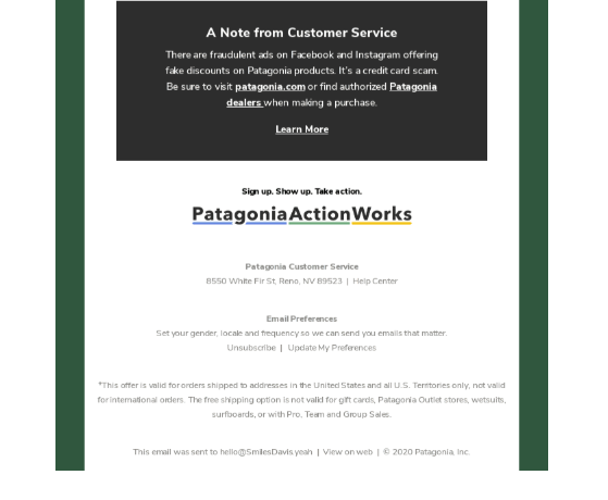
The best footers combine function and flair. Patagonia reinforces its mission with sustainability links next to the legal copy. Starbucks pairs modern design with friendly social prompts that echo its in-store tone. Target and Ulta Beauty use their footers to promote deals and drive app downloads without overwhelming the user. Even minimalist brands like Ralph Lauren find ways to make the footer feel on-brand, although it’s worth noting that style shouldn’t come at the expense of accessibility.
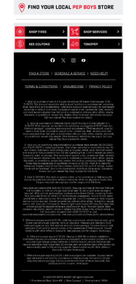
Whether it’s the high-contrast utility of Pep Boys or the cross-promotional clarity of TJ Maxx, great footers respect the user’s time and attention. They provide value right up to the last pixel.
Where to Start With Email Footer Optimization
If your footers are an afterthought today, start by auditing what you’re sending. Look for inconsistencies, missed opportunities, and compliance gaps. Then define what role your footer should play. Is it simply legal scaffolding, or can it drive engagement and reinforce offers?
Once you’ve decided what matters most, gather the right assets, like logos, color codes, icon sets and social handles, and design a responsive, brand-aligned footer that supports your broader goals. Test it across devices. Track how people interact with it. Iterate based on real data.
Make Every Pixel Work Harder with Zeta
Your email footer shouldn’t be dead weight. It should be a powerful tool in your messaging arsenal. When crafted strategically, it leaves a final impression that builds trust, drives clicks, and keeps the brand conversation going.
Zeta’s creative and strategic teams help brands turn every inch of their email templates into performance drivers. From design systems to dynamic personalization, we bring precision and polish to every send.
Ready to upgrade your email templates from header to footer?
