Making It Personal: Three Email Design Trends That Resonate
At their core, trends are a popular expression of a human need. When aligned with emotion and intent, trends create real connection.
Email design trends are no different.
Email designers have been responding to an increasingly stressful world by creating designs that feel more comforting. The goal is to create brand communications that feel more soothing and welcoming in a chaotic, overwhelming inbox. Like comfort food for your email.
What do these email trends look like? And how should each brand translate them (or not)? Evaluate the potential of each through the lens of design elements and principles.
Does the Trend Fit the Brand?
Before tackling any email trend, the first step is to figure out whether or how it can fit the brand. It can be challenging to balance a brand’s established guidelines with evolving design trends—and without compromising brand integrity. Refer to the brand’s guidelines and/or consult with the brand team to evaluate how well each trend aligns with the desired tonality, brand voice, identity, and core values.
Next, analyze how these trends draw from the fundamental elements and principles of design. The best trends borrow from timeless design elements (like points, lines, shapes, colors, textures, etc.) and principles (balance, emphasis, movement, pattern, etc.) to convey emotional meaning. This approach provides a foundation to translate a trend in a way that feels both intentional and aligned with the brand.
Finally, it’s important to understand what each trend telegraphs to the audience. Understanding what emotions each trend conveys allows the designer to be more deliberate in how they communicate visually—because it’s the emotional connections that turn design into a memorable, meaningful experience for users.
How are brands putting these principles into action right now? Let’s take a closer look at three timely email design trends. Each is rooted in emotion, guided by design fundamentals, and full of opportunities for meaningful translation.
Trend 1: Softness to Imagery
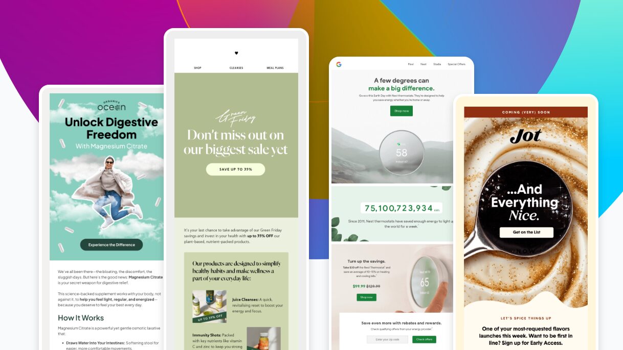
In a world of loud, high-energy visuals, a quieter design trend is making waves. A calm shift that swaps bold contrasts for pastel colors, rounded edges, and emotionally resonant photography.

Key design elements
- Color
- Shape
This trend is all about setting the mood right from the start, with color doing most of the heavy lifting. Soft, calming palettes create a feeling before the viewer even reads a word. In addition to the colors, rounded corners, wavy lines, and gentle serif fonts all work together to give off a sense of ease and comfort.
Key design principles
- Movement
- Unity
Email designs reflecting this trend flow extremely well. Each section glides into the next, and everything feels connected—images, text, layout—they’re all speaking the same soothing language. It’s like the design is guiding the viewer gently through the message.
More than just a look, this trend taps into what people are really craving: honesty, warmth, and a human touch. It moves away from bold and edgy in favor of something that feels real, relaxed, and emotionally in tune.
Trend 2: Doodles Over Images
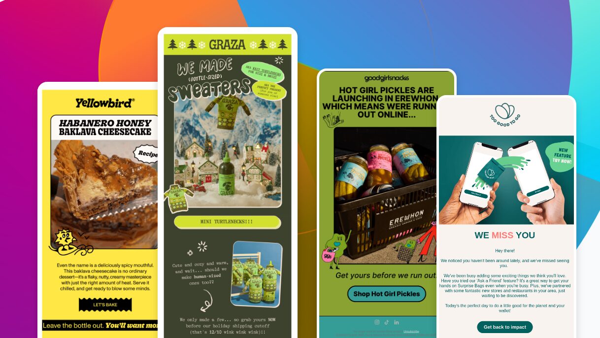
Amongst the day-to-day monotony of org chart updates, Q3 results, and QBRs, this trend incorporates fun, hand-drawn doodles to shake things up.

Key design elements
- Shape
- Texture
- Space
The doodles cut through the usual clean lines and photo grids with something more organic and textured—like little brushstrokes of personality. Depending on the style, they can feel playful, artsy, or even a bit nostalgic.
Key design principles
- Balance
- Movement
- Variety
This design trend is all about balance—mixing illustrations with images and text in a way that keeps the layout flowing. The doodles help guide your eye across the page, filling in gaps and adding motion without overwhelming the design. Each one adds a fresh bit of variety, so nothing feels stale or too polished.
The overall feel is fun, personal, and full of charm. It’s a reminder that a real person is behind the design—someone who’s not afraid to scribble outside the lines a little. It’s creative, a bit nostalgic, and joyful.
Trend 3: The Rounded Box Outline
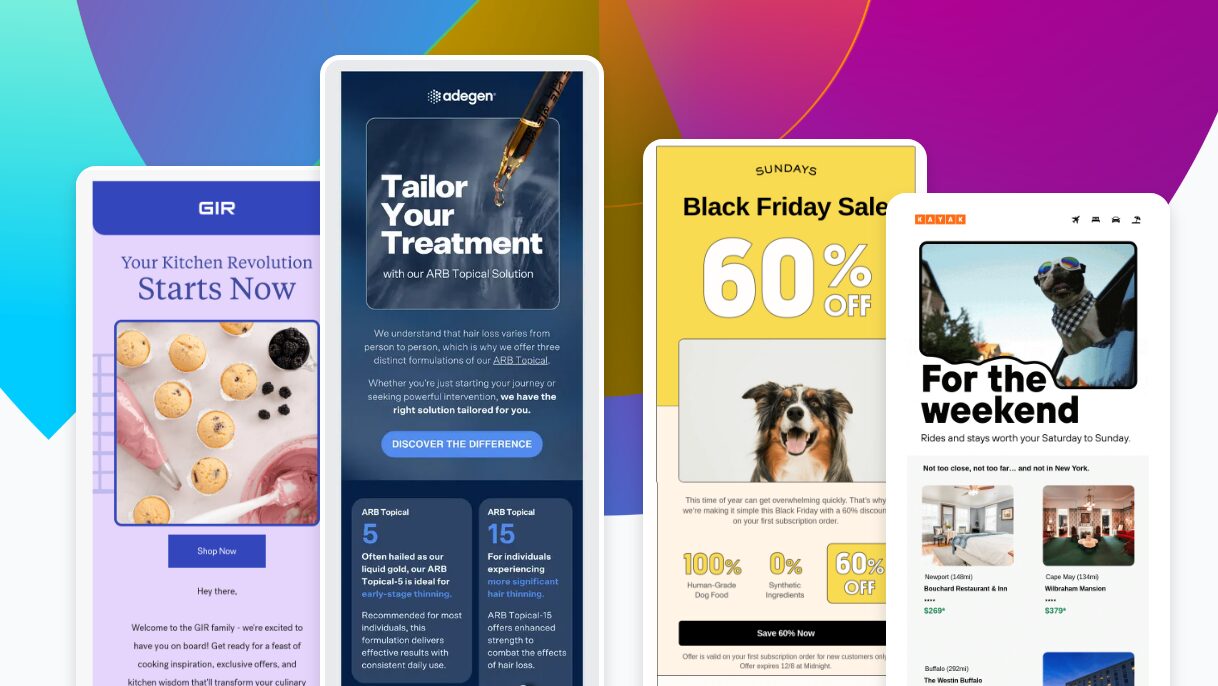
The rounded box outline shapes our stories, gently guiding eyes, defining images and modules with just enough warmth.

Key design elements
- Line
- Color
This trend is all about using lines to shape the layout and give things structure. There’s not a lot of color, but even a simple outline in a brand color can make an image feel ownable. It’s a great way to add identity without going overboard.
Key design principles
- Emphasis
The main idea here is emphasis. These outlines help guide your eye, frame the content, and make everything feel neat and intentional. They give the layout a clear sense of purpose without being too loud.
The overall vibe? Clean, warm, and inviting. It’s like giving your content a visual hug—especially with those rounded edges that soften the whole look. It’s minimal but still full of personality. Perfect for brands that want to feel approachable and friendly, like in wellness, hospitality, or food.
Remember: Trends are Tools, Not Rules
Trends may come and go, but great email design always lives at the intersection of structure and style.
Great design starts with structure—the strategy, behavior data, accessibility rules, and technical constraints that ground our work. Far from limiting creativity, structure enables it. Structure gives us the confidence to explore, knowing we’re building on something solid.
Then comes style—the brand’s personality, instinct, and creative energy. It’s how we shape the message and make it resonate.
When structure and style align, design becomes more than just decoration. It becomes intentional, expressive, and effective. This intersection is where the best work happens, and it’s the lens through which designers should view any trend.
Design forward
While design trends may come and go, the ability to use them with purpose is what transforms visual styles into meaningful brand experiences. These trends aren’t a checklist—they’re raw materials. When paired with thoughtful structure and clear intent, they become tools for deeper connection, stronger storytelling, and better performance.
The real value lies not just in spotting what’s popular, but in understanding why it resonates—and how to adapt it with intention. Whether it’s reimagining a layout, trying an unexpected visual direction, or finally making space for something a little weird, this is permission to experiment.
Bring these ideas back to your team, your clients, your brand. Remix the present. Borrow from the past. And shape the future of what email design can be.


Want to see Zeta in action?

